
The Lay of the Case
Finding Your Way Round A Typecase
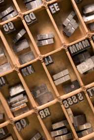
Before you can start composing words you'll need to know where to find the component letters in your type case. It's not difficult, but it might take you a while to learn the layout.
 Two ideas for making life easier are:
- Stick little labels on the case (squares of masking tape are easy to write on, and they come off easily when you don't need them anymore).
- Or stand one of the letters up on end, in each box, so you can see what's hiding in there (as pictured).
Different Lays
There are lots of different kinds of type case, including upper cases, lower cases and double cases (which house both upper and lower case characters), and each of these varies slightly between manufacturers. There's a diverse range of configurations for the type too, because every printshop had its own ideas about which of the little boxes were for which characters, often trying to optimise the layout for their particular line of work.
You need to choose a standard lay for your print shop because working round several different systems at once is a pest and likely to lead to mistakes, especially when dissing (putting the type back where it came from).
Some type has sticky-out bits that overlap the next character (as seen in Garamond Italic), avoiding large gaps between letters. This is called kerning, and kerning faces usually need special ‘high spaces’ for support, otherwise they're likely to break under the pressure of printing. You can order high spaces from Supertype.
The cases you're most likely to be using are double (or jobbing) cases, so lets look at these. Over on the right you have lots of boxes of roughly equal size, for the caps. You'll be pleased to hear there's (almost!) a consensus about these; it's usually only the placement of U and J, the most recent letters to be added to our alphabet, that vary. In the central and left hand section are the lowercase characters. Here letters like z, x, q, k and again j are the ones that tend to wander. Numbers and the less common characters and symbols (like ffl, æ and £) mostly go around the top and left hand edge. Spacing is also kept in the case (particularly where high spaces are needed for kerning faces).
 Making a Decision
Have a look at the Alembic Press's highly informative website, to get an idea just how many possibilities there are. You could use any one of the listed lays in your new print shop but you've probably acquired most of your cases from a retired/expired printer who's already made the decision for you. Stick with it, unless you have an awful lot of rainy days to fill.
If you're starting afresh, we suggest you follow the lead of your printing friends, who you might borrow type from (or lend type to, for that matter). You can download our case lay as a PDF to print out, or there's a blank version to download which you can fill in yourself. It's a good idea to keep this (or something similar) pinned up permanently, for reference.
Click to start download:
HDP Type Case Layout, 240kb PDF
The PDFs contain two sizes or the same image. One's small enough to fit on a single A4 sheet, the other size will print on three sheets which can be stuck together to make a little poster.

You Might Also Like...